· Kenny Nguyen · Developer Guide · 10 min read
Implementing Web Accessibility in 2025: A Technical Guide for Developers
A comprehensive technical guide to implementing web accessibility standards, with code examples, testing methodologies, and best practices.

Implementing Web Accessibility in 2025: A Technical Guide for Developers
As developers, we build the architecture of the digital world. The code we write determines whether that world is open to everyone or filled with barriers. Web accessibility shouldn’t be just a checklist item but rather a fundamental aspect of quality code that ensures our applications work for all users, regardless of their abilities or disabilities.
Understanding the Technical Foundations of Accessibility
Accessibility implementation is built on understanding how people with disabilities use the web:
- Screen reader users navigate by headings, landmarks, and semantic structure
- Keyboard-only users tab through interactive elements in a logical sequence
- Voice recognition users need visible, unique labels for interactive elements
- Users with low vision may zoom up to 400% or use high-contrast modes
- Users with cognitive disabilities need clear language, consistent design, and reduced complexity
This guide will help you build these considerations into your development workflow.
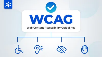
Core Technical Requirements (WCAG 2.1 AA)
The Web Content Accessibility Guidelines (WCAG) 2.1 AA standard has become the de facto legal requirement in most jurisdictions. Here are the key technical areas you need to address:
Semantic HTML: The Foundation of Accessibility
Proper HTML semantics communicate content structure to assistive technologies:
<!-- Instead of this -->
<div class="heading">Product Features</div>
<div class="item">Feature 1</div>
<div class="item">Feature 2</div>

<!-- Use this -->
<h2>Product Features</h2>
<ul>
  <li>Feature 1</li>
  <li>Feature 2</li>
</ul>
Common semantic elements you should prioritize:
<header>,<nav>,<main>,<footer>for landmark regions- Heading hierarchy (
<h1>through<h6>) for content structure <button>for interactive controls (not<div onclick>)<table>with appropriate<th>,<caption>for tabular data<form>,<fieldset>,<label>for input elements
Keyboard Accessibility
All interactive elements must be keyboard accessible:
// Bad: Mouse-only interaction
document.getElementById('custom-dropdown').addEventListener('mouseover', function () {
  this.querySelector('.dropdown-menu').style.display = 'block';
});

// Good: Supports both mouse and keyboard
document.getElementById('custom-dropdown').addEventListener('focus', function () {
  this.querySelector('.dropdown-menu').style.display = 'block';
});
document.getElementById('custom-dropdown').addEventListener('mouseover', function () {
  this.querySelector('.dropdown-menu').style.display = 'block';
});
Additionally, ensure:
- Visible focus indicators (enhanced beyond browser defaults)
- Logical tab order following visual layout
- No keyboard traps that prevent users from moving through the interface
- Skip links to bypass repetitive navigation
Focus Management for Dynamic Content
When content changes dynamically, manage focus to maintain context:
// Example: Moving focus to a modal when it opens
const openModal = () => {
  const modal = document.getElementById('feedback-modal');
  modal.style.display = 'block';

  // Store the element that had focus before opening modal
  modal.previousFocus = document.activeElement;

  // Move focus to the first focusable element in the modal
  const firstFocusable = modal.querySelector('button, [href], input, select, textarea');
  firstFocusable.focus();
};

// Example: Restoring focus when modal closes
const closeModal = () => {
  const modal = document.getElementById('feedback-modal');
  modal.style.display = 'none';

  // Return focus to the element that had it before modal opened
  if (modal.previousFocus) {
    modal.previousFocus.focus();
  }
};
Alternative Text for Images
Provide appropriate text alternatives for images:
<!-- Informative image -->
<img
  src="chart-q1-results.png"
  alt="Q1 sales increased 25% year-over-year, with strongest growth in the European market"
/>

<!-- Decorative image -->
<img src="decorative-divider.png" alt="" role="presentation" />

<!-- Complex image with extended description -->
<figure>
  <img src="data-visualization.png" alt="2025 Market Share Distribution Chart" />
  <figcaption>
    <details>
      <summary>Detailed description of market share visualization</summary>
      <p>
        This chart shows the market share distribution across five segments: Enterprise (45%), SMB (30%), Government
        (15%), Education (7%), and Non-profit (3%).
      </p>
    </details>
  </figcaption>
</figure>
Color and Contrast
Ensure sufficient contrast and don’t rely solely on color:
/* Poor contrast */
.button-low-contrast {
  color: #767676; /* Gray text */
  background-color: #a0a0a0; /* Light gray background */
}

/* Good contrast (4.5:1 ratio for normal text) */
.button-accessible {
  color: #ffffff; /* White text */
  background-color: #025682; /* Dark blue background */
}

/* Indicating state with color AND icon */
.error-message {
  color: #d32f2f; /* Red text */
  border-left: 4px solid #d32f2f;
}

.error-message::before {
  content: '⚠️'; /* Warning icon */
  margin-right: 8px;
}
To verify contrast ratios, use tools like:
- WebAIM Contrast Checker
- Browser DevTools (Chrome, Firefox, and Edge have built-in contrast checkers)
Form Accessibility
Create accessible forms with clear labels and error handling:
<!-- Basic accessible form field -->
<div class="form-group">
  <label for="full-name">Full Name</label>
  <input type="text" id="full-name" name="full-name" autocomplete="name" aria-required="true" />
</div>

<!-- Error handling -->
<div class="form-group">
  <label for="email">Email Address</label>
  <input type="email" id="email" name="email" aria-describedby="email-error" aria-invalid="true" />
  <div id="email-error" class="error-message" role="alert">Please enter a valid email address</div>
</div>
Form best practices:
- Associate labels with inputs using
forandidattributes - Group related fields with
fieldsetandlegend - Use appropriate input types (
email,tel, etc.) - Provide clear error messages with
aria-describedby - Indicate required fields both visually and with
aria-required
ARIA: When HTML Isn’t Enough
ARIA (Accessible Rich Internet Applications) attributes enhance accessibility when native HTML semantics aren’t sufficient:
<!-- Custom dropdown implementation -->
<div class="custom-select" role="combobox" aria-expanded="false" aria-haspopup="listbox" aria-labelledby="select-label">
  <span id="select-label">Choose a category</span>
  <div role="listbox" id="options-list">
    <div role="option" id="option1" aria-selected="false">Option 1</div>
    <div role="option" id="option2" aria-selected="false">Option 2</div>
  </div>
</div>
Important ARIA practices:
- No ARIA is better than bad ARIA - Only use when necessary
- Don’t override native semantics - Don’t add
role="button"to a<div>when you could use<button> - Keep states updated - Ensure
aria-expanded,aria-selected, etc. stay in sync with UI changes - Test with assistive technology - Verify ARIA implementation works with actual screen readers
Dynamic Content and Live Regions
When content updates dynamically, ensure screen reader users are informed:
<!-- Announce non-critical updates -->
<div aria-live="polite" role="status">Your changes have been saved</div>

<!-- Announce critical updates -->
<div aria-live="assertive" role="alert">Session expiring in 2 minutes. Click to extend.</div>
Responsive Design for Accessibility
Create layouts that adapt to different needs:
/* Support text resizing up to 200% */
body {
  font-size: 100%; /* Use relative units */
  line-height: 1.5;
}

/* Ensure touch targets are large enough */
button,
.clickable {
  min-height: 44px;
  min-width: 44px;
  padding: 12px;
}

/* Respect user preferences for reduced motion */
@media (prefers-reduced-motion: reduce) {
  * {
    animation-duration: 0.01ms !important;
    transition-duration: 0.01ms !important;
    scroll-behavior: auto !important;
  }
}

/* Respect user preference for contrast */
@media (prefers-contrast: more) {
  :root {
    --text-color: #000000;
    --background-color: #ffffff;
    --link-color: #0000ee;
  }
}
Framework-Specific Implementations
React Accessibility
// Accessible toggle button in React
import React, { useState } from 'react';

const ExpandableSection = ({ title, children }) => {
  const [isExpanded, setExpanded] = useState(false);

  return (
    <div className="expandable-section">
      <button
        className="expandable-trigger"
        onClick={() => setExpanded(!isExpanded)}
        aria-expanded={isExpanded}
        aria-controls="content-section"
      >
        {title} {isExpanded ? '▼' : '►'}
      </button>
      <div id="content-section" className={`expandable-content ${isExpanded ? 'expanded' : ''}`} hidden={!isExpanded}>
        {children}
      </div>
    </div>
  );
};
When working with React:
- Use fragments (
<>...</>) to avoid unnecessary divs - Manage focus deliberately when content changes
- Use key props appropriately for dynamic lists
- Consider react-axe for development-time accessibility testing
Vue Accessibility
<!-- Accessible modal component in Vue -->
<template>
  <div v-if="isVisible" class="modal-overlay" @keydown.esc="close">
    <div class="modal" role="dialog" aria-labelledby="modal-title" aria-modal="true" ref="modalElement">
      <h2 id="modal-title">{{ title }}</h2>
      <div class="modal-content">
        <slot></slot>
      </div>
      <button @click="close" class="close-button">Close</button>
    </div>
  </div>
</template>

<script>
export default {
  props: {
    title: String,
    isVisible: Boolean,
  },
  methods: {
    close() {
      this.$emit('close');
    },
  },
  watch: {
    isVisible(newValue) {
      if (newValue) {
        this.$nextTick(() => {
          // Focus first element when modal opens
          this.$refs.modalElement.focus();
          // Trap focus within modal
          this.previouslyFocused = document.activeElement;
        });
      } else if (this.previouslyFocused) {
        // Restore focus when modal closes
        this.previouslyFocused.focus();
      }
    },
  },
};
</script>
Testing Accessibility Implementation
1. Automated Testing Tools
Integrate these tools into your development workflow:
// Example: Integration with Jest and axe-core for component testing
import React from 'react';
import { render } from '@testing-library/react';
import { axe, toHaveNoViolations } from 'jest-axe';
import SearchForm from './SearchForm';

expect.extend(toHaveNoViolations);

describe('SearchForm component', () => {
  it('should not have accessibility violations', async () => {
    const { container } = render(<SearchForm />);
    const results = await axe(container);
    expect(results).toHaveNoViolations();
  });
});
Popular automated testing tools:
- axe-core - Can be integrated into any testing framework
- jest-axe - For Jest integration
- cypress-axe - For Cypress integration
- eslint-plugin-jsx-a11y - For React-specific linting
2. Manual Testing Techniques
No automated tool can replace human testing:
Keyboard Testing Protocol
- Remove your mouse and navigate using only keyboard
- Tab through all interactive elements in sequence
- Verify that focus indicators are clearly visible
- Test all functionality using keyboard shortcuts
- Ensure there are no keyboard traps
Screen Reader Testing Matrix
Test with at least one screen reader from each category:
- NVDA or JAWS on Windows
- VoiceOver on macOS/iOS
- TalkBack on Android
For each test:
- Navigate page structure via headings
- Complete key user flows (forms, navigation)
- Verify that dynamic updates are announced
3. User Testing
The ultimate accessibility test is with real users:
- Recruit participants with various disabilities
- Include people who regularly use assistive technologies
- Observe their interaction with your application
- Document challenges and iterate on solutions
Implementing Web Accessibility in Your Workflow
1. Start with Accessibility Linting
Add accessibility linting to your code editor and CI pipeline:
For ESLint:
// .eslintrc.js
module.exports = {
  plugins: ['jsx-a11y'],
  extends: ['plugin:jsx-a11y/recommended'],
};
2. Create Accessible Component Libraries
Build accessibility into your design system:
- Document accessibility features of each component
- Include accessibility acceptance criteria in component specs
- Create automated tests for accessibility properties
3. Define Developer Acceptance Criteria
Add accessibility criteria to feature requirements:
Feature: Product Filtering
Acceptance Criteria:
1. Filter controls must be operable by keyboard
2. Filter status changes must be announced to screen readers
3. Selected filters must be visually distinct AND programmatically indicated
4. Filtering results must not cause focus to be lost
4. Continuous Monitoring
Integrate accessibility scanning into your build process:
- Run automated tests in CI/CD pipeline
- Block merges if accessibility regressions are detected
- Schedule regular manual audits as part of release cycles
Advanced Accessibility Techniques
ARIA Design Patterns for Complex Widgets
When building complex widgets, follow established ARIA patterns:
<!-- Tabs pattern example -->
<div class="tabs">
  <div role="tablist" aria-label="Account settings">
    <button role="tab" id="tab-1" aria-selected="true" aria-controls="panel-1">Profile</button>
    <button role="tab" id="tab-2" aria-selected="false" aria-controls="panel-2" tabindex="-1">Preferences</button>
  </div>

  <div id="panel-1" role="tabpanel" aria-labelledby="tab-1">
    <!-- Profile content -->
  </div>
  <div id="panel-2" role="tabpanel" aria-labelledby="tab-2" hidden>
    <!-- Preferences content -->
  </div>
</div>
// JavaScript for managing tab interaction
document.querySelectorAll('[role="tab"]').forEach((tab) => {
tab.addEventListener('click', changeTabs);
tab.addEventListener('keydown', (e) => {
// Arrow key navigation
if (e.key === 'ArrowRight' || e.key === 'ArrowLeft') {
e.preventDefault();
const tabs = Array.from(e.target.parentNode.querySelectorAll('[role="tab"]'));
const currentIndex = tabs.indexOf(e.target);
const direction = e.key === 'ArrowRight' ? 1 : -1;
const newIndex = (currentIndex + direction + tabs.length) % tabs.length;
// Set focus to new tab
tabs[newIndex].focus();
// Activate the newly focused tab
tabs[newIndex].click();
}
});
});
function changeTabs(e) {
const selectedTab = e.target;
const tablist = selectedTab.parentNode;
const tabpanels = document.querySelectorAll('[role="tabpanel"]');
// Deselect all tabs
tablist.querySelectorAll('[role="tab"]').forEach((tab) => {
tab.setAttribute('aria-selected', 'false');
tab.setAttribute('tabindex', '-1');
});
// Select clicked tab
selectedTab.setAttribute('aria-selected', 'true');
selectedTab.setAttribute('tabindex', '0');
// Hide all tabpanels
tabpanels.forEach((panel) => (panel.hidden = true));
// Show selected tabpanel
const controlledPanelId = selectedTab.getAttribute('aria-controls');
document.getElementById(controlledPanelId).hidden = false;
}Reference the ARIA Authoring Practices Guide for implementation details for various components.
Supporting Reduced Motion Preferences
For users with vestibular disorders, motion can cause physical discomfort:
/* Base animation */
.animated-element {
  transition: transform 0.5s ease-in-out;
}

/* Respect user preference */
@media (prefers-reduced-motion: reduce) {
  .animated-element {
    transition: none;
  }
}
Supporting Color Contrast Preferences
Some users need enhanced contrast:
/* Base styles */
:root {
  --text-color: #333;
  --background: #fff;
  --accent-color: #0066cc;
}

/* High contrast mode */
@media (prefers-contrast: more) {
  :root {
    --text-color: #000;
    --background: #fff;
    --accent-color: #0000cc;
  }
}
Common Accessibility Implementation Pitfalls
Accessibility Overlays
Avoid “accessibility overlay” solutions that claim to fix accessibility with a single script. They:
- Often conflict with actual assistive technologies
- Don’t address underlying code issues
- May create a worse experience for users with disabilities
- Don’t provide legal protection
Reinventing UI Components
When possible, use native HTML elements rather than custom implementations:
- Native
<select>is more accessible than a custom dropdown - Native
<button>provides keyboard and focus management automatically - Native
<input type="date">handles date selection accessibly
Common Anti-Patterns to Avoid
Click handlers on non-interactive elements:
<!-- Bad -->
<div onclick="submitForm()">Submit</div>

<!-- Good -->
<button type="button" onclick="submitForm()">Submit</button>
Non-semantic tables:
<!-- Bad -->
<div class="table">
  <div class="row">
    <div class="cell">Name</div>
    <div class="cell">Email</div>
  </div>
</div>

<!-- Good -->
<table>
  <thead>
    <tr>
      <th>Name</th>
      <th>Email</th>
    </tr>
  </thead>
  <tbody>
    <!-- Table rows here -->
  </tbody>
</table>
Empty links or buttons:
<!-- Bad -->
<a href="profile.html" aria-label="Profile"><i class="icon-profile"></i></a>

<!-- Good -->
<a href="profile.html">
  <i class="icon-profile" aria-hidden="true"></i>
  <span>Profile</span>
</a>
Conclusion: Accessibility as Engineering Excellence
Implementing accessibility should be viewed as part of engineering excellence rather than a compliance burden. Accessible code is typically:
- More semantic and meaningful
- More maintainable and future-proof
- More usable across different contexts
- More robust against edge cases
By integrating accessibility into your development workflow, you’re not just meeting legal requirements—you’re building better products for everyone.